10 Vintage Bottle Caps That Changed Advertising Forever

Coca-Cola Crown Corks: The Birth of Branded Packaging
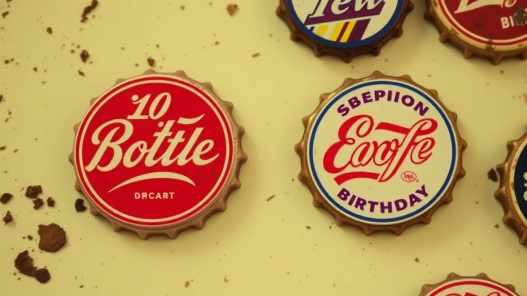
Pabst Blue Ribbon: The First Painted Bottle Caps
Dr Pepper's 10-2-4 Marketing Campaign Caps
Pepsi-Cola's Double Dot Era Collectibles
Miller High Life: The Champagne of Beers Caps
Why Did Bottle Caps Become Marketing Powerhouses?
Bottle caps transformed from simple seals into miniature billboards that reached millions of consumers daily. Before television dominated living rooms and long before smartphones demanded attention, these small metal discs carried brand messages directly into homes, workplaces, and social gatherings. Smart marketers recognized that caps weren't just functional—they were persistent, portable advertisements that stayed visible until the last drop was consumed. For collectors today, understanding which caps pioneered advertising techniques offers insight into how modern consumer culture took shape. These ten examples didn't just promote products; they invented strategies still used in marketing departments worldwide.
What Was the First Bottle Cap Used For Advertising?
The Crown Cork—patented by William Painter in 1892—became the first practical bottle seal that also served promotional purposes.
Painter's invention solved a genuine problem: keeping carbonated beverages from going flat. But the real genius lay in the flat metal surface that could display logos, slogans, and company names. Early Crown Corks featured simple embossed designs for Baltimore's Clipper Brewing Company and other regional producers. These weren't flashy by today's standards—just raised letters identifying the manufacturer.
Here's the thing: Painter didn't set out to create an advertising medium. He wanted a reliable seal. Yet within five years, breweries realized customers kept caps as souvenirs or used them in household games. The cap had become a keepsake, not merely garbage. That shift—from disposable seal to collectible touchpoint—established the template for promotional packaging that persists today.
The Crown Holdings company (still operating) estimates that over one trillion Crown Corks have been produced since 1892. That's a lot of tiny billboards.
How Did Coca-Cola Perfect the Promotional Bottle Cap?
Coca-Cola's 1920s bottle caps introduced the concept of brand ubiquity—making the logo visible everywhere, all the time.
The red-and-white disc became instantly recognizable across American diners, drug stores, and grocery shelves. Unlike competitors who changed designs frequently, Coca-Cola maintained visual consistency. Customers didn't need to read the words; the color scheme alone triggered recognition. This wasn't accidental—it was the advertising strategy of Robert W. Woodruff, who understood that repetition builds trust.
Early Coke caps featured simple "Coca-Cola" script in white against the famous red background. Variations included "Drink Coca-Cola" and later "Ice Cold Coca-Cola"—subtle nudges toward consumption. The caps appeared on both the contoured bottle (introduced 1915) and standard straight bottles, multiplying touchpoints.
Worth noting: Coca-Cola didn't just produce caps; they produced an expectation. The sound of a bottle opener piercing that red disc signaled refreshment. That sensory association—sound, sight, and eventual taste—created a complete brand experience from a single small object.
Which Bottle Cap Introduced the Prize Inside?
The White Rock "Tommy" cap pioneered the promotional contest model when the company began hiding numbered caps that could be redeemed for prizes.
White Rock Mineral Springs started their campaign in the early 1900s, placing caps with numbers inside standard seals. Customers collected these, hoping to win anything from free soda to cash awards. The strategy proved so successful that competitors scrambled to copy it within months.
This wasn't mere generosity—it was customer retention disguised as generosity. The catch? You had to buy multiple bottles to collect winning numbers. Some collectors bought cases, sorting through caps like lottery tickets. The White Rock Company saw sales spike during promotion periods, establishing the "collect-and-win" model that cereal companies, fast-food chains, and beverage makers still employ.
The Tommy character (a winged cherub) appeared on early caps, adding visual appeal to the functional prize mechanism. Finding a Tommy cap meant something special might wait inside.
Did Military Caps Change Collector Culture?
World War II-era bottle caps from Ortlieb's and Schlitz introduced patriotic messaging that transformed casual drinking into civic participation.
Breweries during the 1940s faced a dilemma: how to advertise when metal rationing limited production and public sentiment favored austerity? The solution was patriotic cap designs featuring slogans like "Buy War Bonds" and "Remember Pearl Harbor." These weren't just decorations—they were morale builders.
Ortlieb's Brewing of Philadelphia produced caps with military insignias and eagle motifs. Schlitz (then America's largest brewery) featured red-white-and-blue designs with messages supporting troops. Drinkers weren't just consuming beer; they were displaying patriotism with every opened bottle.
This period established that bottle caps could carry messages beyond product promotion. The medium proved flexible enough for social causes, political statements, and community building. Post-war collectors began organizing these caps by theme rather than brand, creating the categorical collecting approach still used today.
When Did Bottle Caps Become Art Pieces?
The Squirt citrus soda caps of the 1950s and 60s elevated bottle cap design through illustrated characters and narrative scenes.
Squirt's marketing team commissioned artists to create ongoing "cap stories"—sequential images that encouraged collection. The bubbly elf mascot appeared in various scenarios: fishing, dancing, playing sports. Each cap was a miniature painting, not merely a logo vehicle.
This approach recognized that consumers—especially younger ones—responded to visual storytelling. A child might pester parents for another Squirt not because they craved the beverage, but because they needed the next cap to complete a set. The Squirt brand (now owned by Keurig Dr Pepper) maintained this artistic emphasis for decades.
Artistic caps also attracted adult collectors who appreciated the design evolution. Companies began hiring professional illustrators specifically for cap artwork, treating these small circles as seriously as magazine advertisements or billboards.
What Made Sports Team Caps So Collectible?
Stroh's Brewery created the definitive sports partnership model when they began featuring Major League Baseball team logos on their bottle caps in the 1960s.
The Detroit-based brewery negotiated licensing agreements that allowed them to reproduce team emblems on millions of caps distributed nationwide. This wasn't regional marketing—it was national brand building through America's pastime. Baseball fans who might never visit Michigan suddenly encountered Stroh's through their favorite team's logo.
The licensing strategy worked because it targeted existing passions. Beer drinkers often followed sports; sports fans often drank beer. By merging these identities onto a single small object, Stroh's created a tangible connection between consumer habits and leisure activities.
| Cap Type | Peak Era | Key Innovation | Average Collector Value Today |
|---|---|---|---|
| Crown Cork (plain) | 1892-1910 | First functional seal with branding | $5-$50 (rare variants up to $200) |
| Coca-Cola Standard | 1920-1960 | Color consistency for instant recognition | $1-$15 (mint condition) | White Rock Prize Caps | 1905-1930 | Contest mechanics inside packaging | $10-$75 (numbered variants) |
| WWII Patriotic | 1941-1945 | Messaging beyond product promotion | $8-$40 (depending on rarity) |
| Squirt Illustrated | 1950-1970 | Narrative artwork and character development | $3-$25 (sequential sets higher) |
| Stroh's Sports | 1960-1980 | Licensed team logo reproduction | $5-$30 (complete team sets $100+) |
How Did Plastic Liners Revolutionize Cap Advertising?
The introduction of PVC liners in the 1950s allowed companies to print directly on the inside of caps, effectively doubling the available advertising space.
Previously, caps contained simple cork or paper liners that protected flavor but offered no promotional opportunity. The plastic liner changed everything. Suddenly, breweries could print puzzles, jokes, facts, or additional branding inside the cap—messages revealed only after opening.
Rainier Beer (Seattle) became famous for their "puzzle caps" featuring brain teasers and riddles. Customers collected caps specifically for the entertainment value, treating them as portable amusement devices. That said, the real advertising genius was requiring removal of the liner to read it—customers physically interacted with the brand longer, increasing recall.
This dual-surface approach persists today. Modern craft breweries often print batch numbers and brewing dates inside caps (practical information that also suggests artisanal credibility). The interior has become as valuable as the exterior for conveying brand values.
Which Cap Introduced the Barcode?
The Schmidt Beer "Collector Series" of the 1980s pioneered the use of scannable elements and serialized numbering for inventory and authentication.
While not true barcodes in the modern sense, Schmidt's wildlife series caps featured printed numbers that allowed the company to track distribution patterns and verify authenticity. Collectors could mail in specific numbers for prizes, creating interaction between physical objects and corporate databases.
This foreshadowed modern QR code campaigns and NFC-enabled packaging. The Schmidt approach recognized that caps could be data collection tools, not merely outbound advertising. Every cap opened provided information about where products sold, which designs resonated, and which regions needed increased marketing attention.
The wildlife artwork—depicting Minnesota birds, fish, and mammals—also established that "local" imagery could drive national interest. People who'd never visited the Midwest purchased Schmidt specifically for the regional artwork.
What Made Foreign Bottle Caps Different?
Japanese beer caps from Kirin and Sapporo introduced foil stamping, embossing, and metallic finishes that American breweries wouldn't adopt for decades.
While U.S. companies focused on printed designs, Japanese manufacturers treated caps as jewelry. The Kirin "Gold Cap" featured actual gold-colored foil applied through hot-stamping processes. Sapporo used raised embossing that created tactile experiences—customers felt the dragon logo as much as they saw it.
These techniques served practical purposes in Japan's competitive beverage market. With limited refrigerator space in typical households, beer often sat at room temperature in stores. The flashy caps caught attention on shelves, compensating for lack of cold-box placement. American collectors encountering these imports recognized immediately that cap design had evolved differently overseas.
Here's the thing about foreign caps: they taught collectors that bottle cap aesthetics weren't universal. Cultural preferences shaped design choices. German caps emphasized brewing tradition; Mexican caps favored bright colors; Scandinavian caps often featured minimalist typography. This global variety expanded collecting from national hobby to international pursuit.
Are Vintage Bottle Caps Still Relevant to Modern Advertising?
Absolutely—the strategies pioneered on these small metal discs now dominate digital marketing.
The "prize inside" concept evolved into app-based loyalty programs and gamified shopping experiences. Coca-Cola's color consistency became the "brand guidelines" that govern every corporate Instagram post. The Squirt narrative approach? That's content marketing—ongoing storytelling that builds audience investment over time.
Modern craft breweries have revived vintage cap aesthetics specifically because they signal authenticity. Serious collectors now pay premium prices for limited-release caps from microbreweries that understand this heritage. The physical object retains power precisely because it's tangible in an increasingly virtual world.
That said, the advertising revolution isn't finished. New closure technologies—twist-offs, screw caps, cans—reduced cap visibility in recent decades. Yet the collectible market persists, and some craft producers have returned to traditional crowns specifically for their nostalgic appeal. What's old becomes new again.
Portland's own craft beer scene offers prime examples. Local breweries like Hair of the Dog and Cascade Brewing release caps with intricate artwork that rivals anything from the 1950s golden age. These aren't afterthoughts—they're central to brand identity, just as William Painter's simple metal disc became central to a billion-dollar industry.
The next time you open a bottle, pause before discarding that cap. You're holding a piece of advertising history—a medium that proved small objects can carry massive messages.